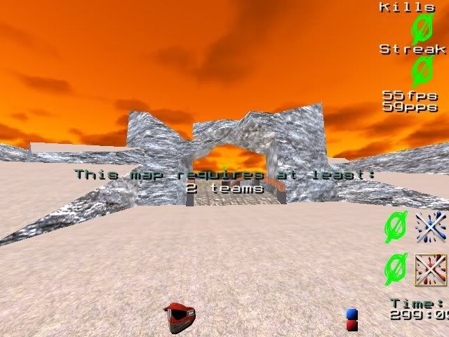
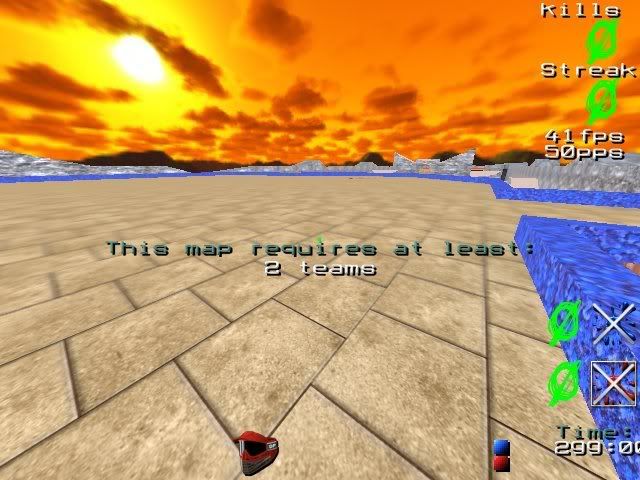
yeah badlands is taken, it's a pretty popular match map >.>
Ok this map represents what I hate with some mappers. I can't stand unnatural squarish looking features that are supposed to be terrain. They just look bad. Try to round everything off, it's hard to enjoy gameplay for me when I feel like I'm playing in a world of rectangles.

This is what I'm talking about. Right here and all over the map. No real design flow, too boxy. Everywhere in the map is open and squared off. Add some huge separation cliffs in the middle or something to make it less open, and round off darn near all of the corners. As you can tell by my maps(roanoke in particular) I'm a fiend for detail, and that's what this map lacks.

Just more lack of detail. what the hell is going on up here? Does this place serve a purpose?
I like the map's general design, especially the base. You just need to work on your outdoor scenes. Work with the limitations of the engine, carve up outdoor areas into smaller parts separated by huge rocky walls or something, it usually looks much better because then you can add much more detail into the scene without soaring the r_speeds.
Pump a lot more general detail into this map, and it could be a real winner

also when you create areas like the roof, think "what the hell is this going to be used for?" Right now there are some places in this map that serve no purpose at all other than to be huge open spaces.
Edit: Sorry if I seem harsh, I really think you have a lot of potential as a mapper, you just need to think some things through a little more and add a touch more detail

Keep up the good work and please take this through beta 2, the general idea is nice, just needs polish.
Edit2: I was overly harsh, I appologize. the map does indeed have detail, the squarish features just caught my eye first and set me off. I'm sorry it doesn't need near the complete overhaul I first said. The squarish features just bug me a lot
