We played this map a couple times in JMR's 2v2 tournament, and I actually really like the way it plays. I'd say this is actually a good candidate for the official map list, and I'd like to see it finished up.
Here's some screenshots with feedback:
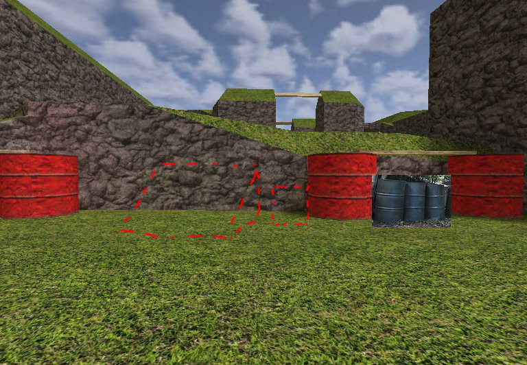
There should really be a faster, more straightforward way out of here. It's annoying to have to back track to get out, especially when you spawn here. Possibly add a (new player accessible) ramp, small boxes, lower the terrain, or even consider using more realistic sized barrels (about half a person's height). Shorter barrels would actually be perfect here.
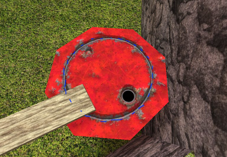
Speaking of barrels, you should at least line the brush up with the standard barrel textures (24 unit radius).
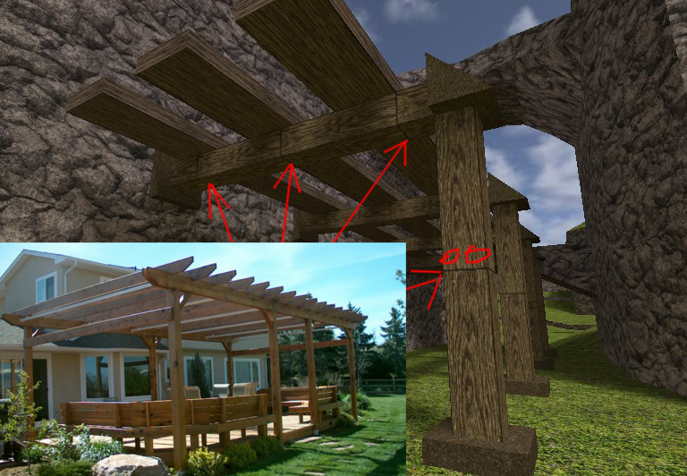
On this pergola thing, the wood plank textures really don't make sense. Why would there be gaps in the wood here, and what are the planks nailed to? I threw in a photo of a real pergola for reference. I would use a different texture (solid wood) or maybe scale the planks so you don't see the gaps (though a stretched texture may look bad).
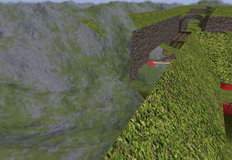
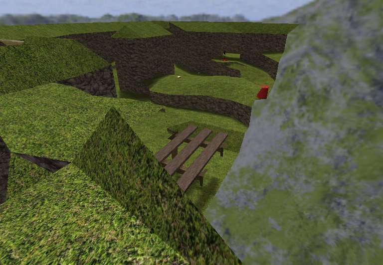
If you're going to make this a viable play area, you should make sure you can't see through the sky anywhere. It just looks bad. You would need to either add more cliff area in place of the sky, build the grass ledge out further so there are no sections of sky that overlap the map, or just build the cliffs higher and clip off these areas so players can't go up there. You might also consider raising the sky so you don't hit your head...
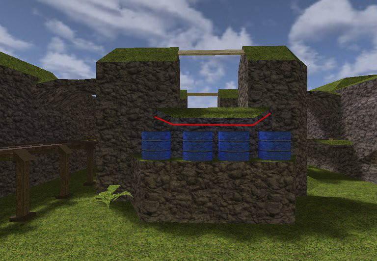
You should drop this down slightly so that it's within stepping range. The way it is now, you can land on closer edge of the barrels and jump, and it's fine. You can skip the barrels and land on the cliff edge, and it's fine. If you land on the far edge of the barrels, just short of the cliff, though, it completely kills your momentum.
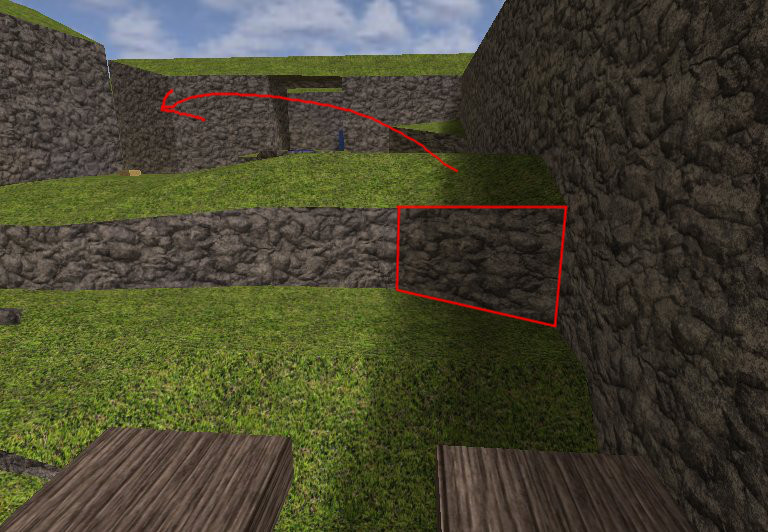
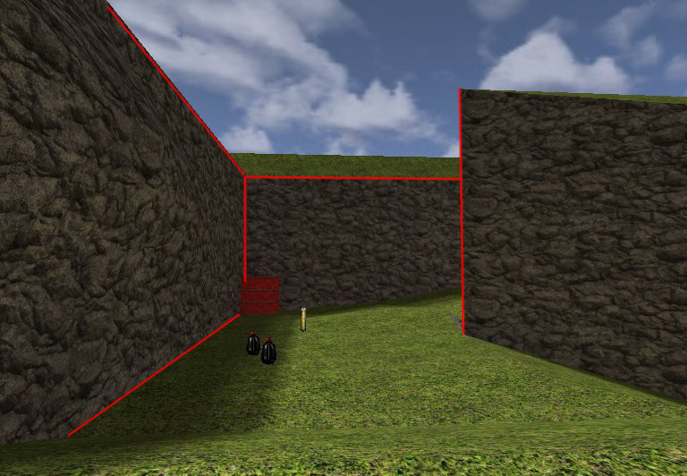
Kind of a minor thing, but if you jump up the hill too far on the right, you hit the brush face highlighted in red and it sends you flying way off to the left of the flag stand. Perhaps consider moving that brush back a bit or altering it somehow. I think it might also be a good idea to add a small box or something in this area as well to make the path a little more accessible to new players.
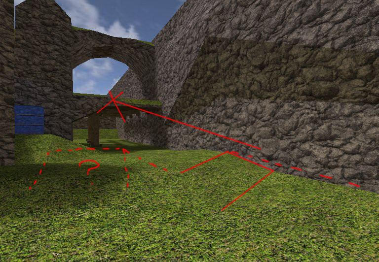
This slight ramp in the terrain (solid red outline) can send you flying into the arch/pergola thing. I'd flatten that terrain out (dotted line on the right) but possibly add a hill with a steeper ramp to make it so people can deliberately jump onto the pergola if they want to. I don't know if it would be better to have the ramp on the left or right side, but I think there should be a clear flat path and ramped path to make it so players can consciously decide if they want to go high or low, not a subtle bump in the terrain that causes unexpected air.
Some of the walls have very harsh, unnatural 90 degree edges. I'd work on those a bit.