Here is the post with my opinions from the "Re: jitspoe's .plan" thread:
The few hr4 textures from 2011 on dplogin.com (i don't know, if you want to keep or remake the other ones, so i only talk about the new textures) are looking good. Especially "city6_8", "rock4_2", "rocks19_1", "rrock1_2" and "wood1_1" are very nice ingame. But there are also three textures, which i personally don't like or which can have a little tweak in my opinion. Let's start with the texture, which needs the tweak: "stonewal". There is a little bit too much red in it. And now the textures "metal2_5" and "metal5_8": They look completely low res, too rusty and too brown ingame. The normal low res texture is grey instead of brown. The color of your new textures is more like "metal2_6" and "metal8_1", but only the color. They look too low res to only rename them.
What do you think about this ones (
metal2_5,
metal5_8)?
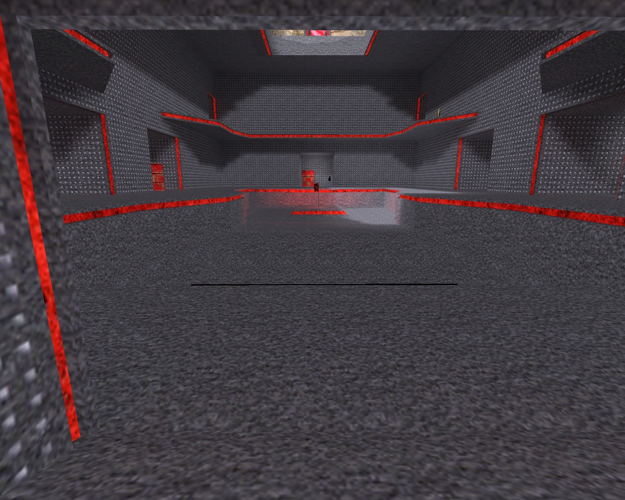
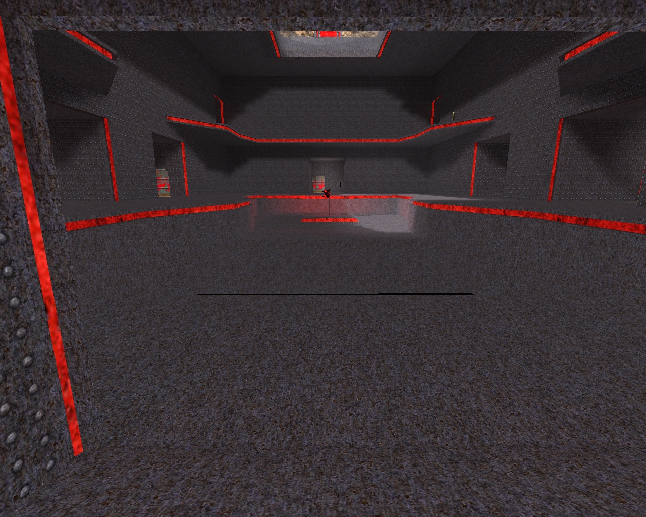
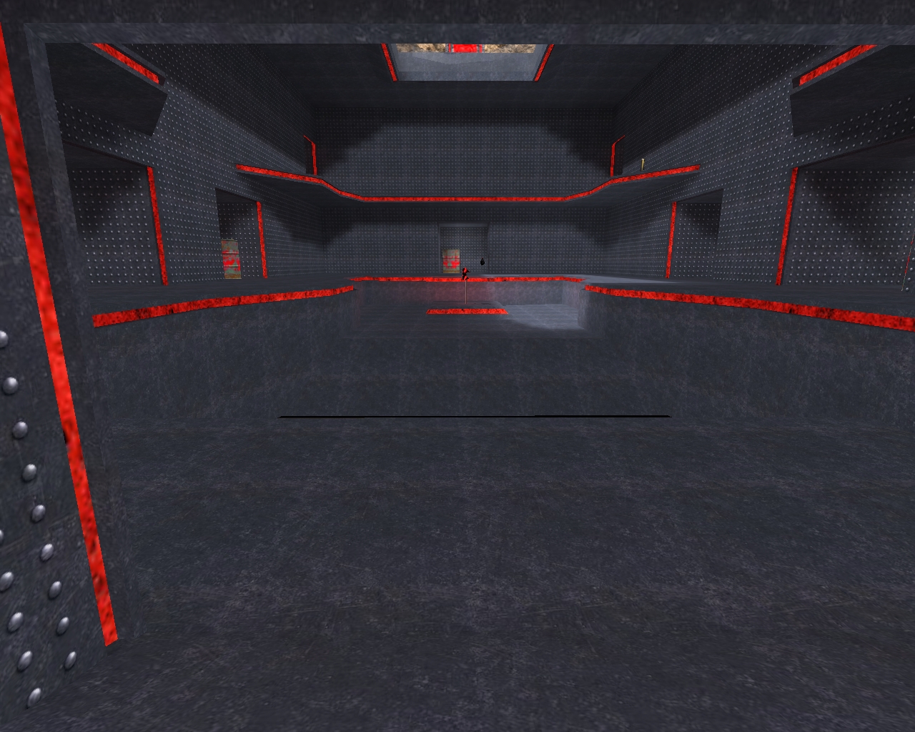
Here are screenshots, how it looks ingame with the low res textures (img 1), your new textures (img 2) and the one, i suggested (img 3):
Edit: Here are two more screenshots. Low res and official hr4.
rrock1_2: Looks really good in the background and ok from the near.
w_metal1: Looks too much detailed and because of that unrealistic. Maybe make it with big plain areas and not so much perforated. The structure from b_tile.jpg could look really good for that.
metal2_5: Like the pictures above this "edit"-part. Too much rust, brown instead of grey and the points need to be brighter to see them as good as in low res. Maybe bigger plain areas (for the background) with only 10-20% rust looks better. If you don't want to use the one from above, i would prefer to make something very similar to that one. It looks pretty nice, detailed and clear ingame.
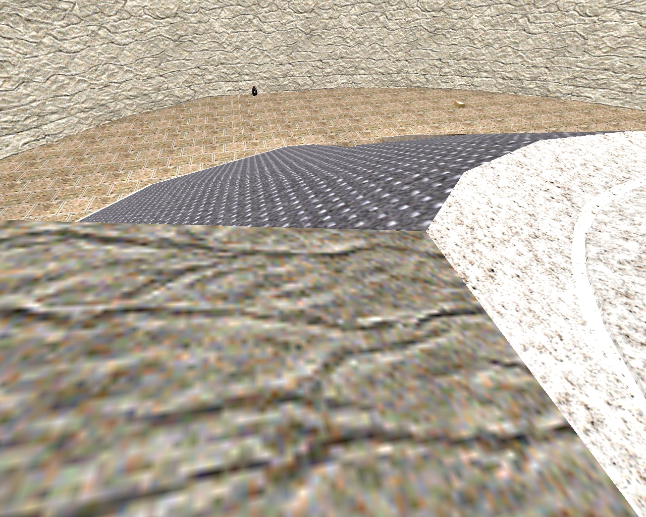
metal4_8: It's yellow, but the texture itself isn't that bad. I would like to see how it looks ingame with only 25% and 50% of the yellow stripes. That we can see more from the part, which is in the background now.
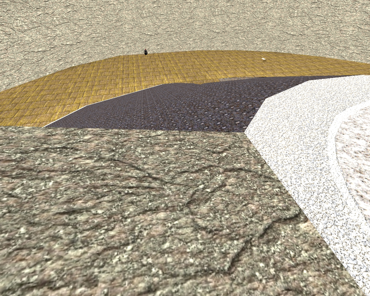
Without a picture:
- metal1_2.jpg: looks also low res ingame.
- metal2.jpg: Looks pixelated and without clear borders around the points. Maybe a toooo high compression?