Hey I felt I have something to say on this topic that may or may not benefit you in anyway. This is purely my recommendations and they are not the best for sure but I felt i needed to say them I'm not going to bring up misaligned textures or anything like that because im sure you can fix them.
Here Goes:
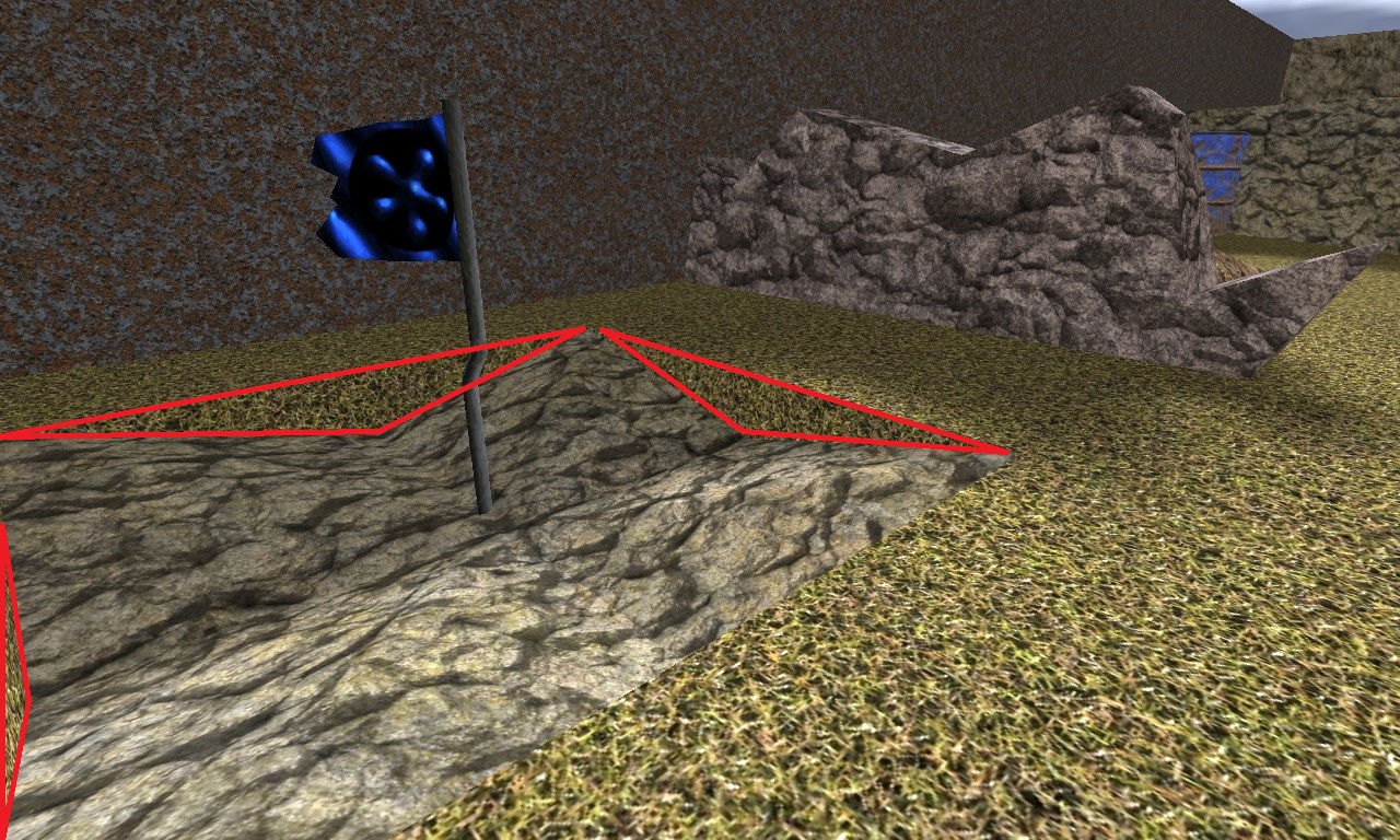
In the parts highlighted i would like to see a different texture on the face on the rock in my opinion it looks more natural.
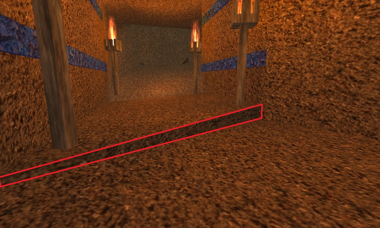
And the same here.
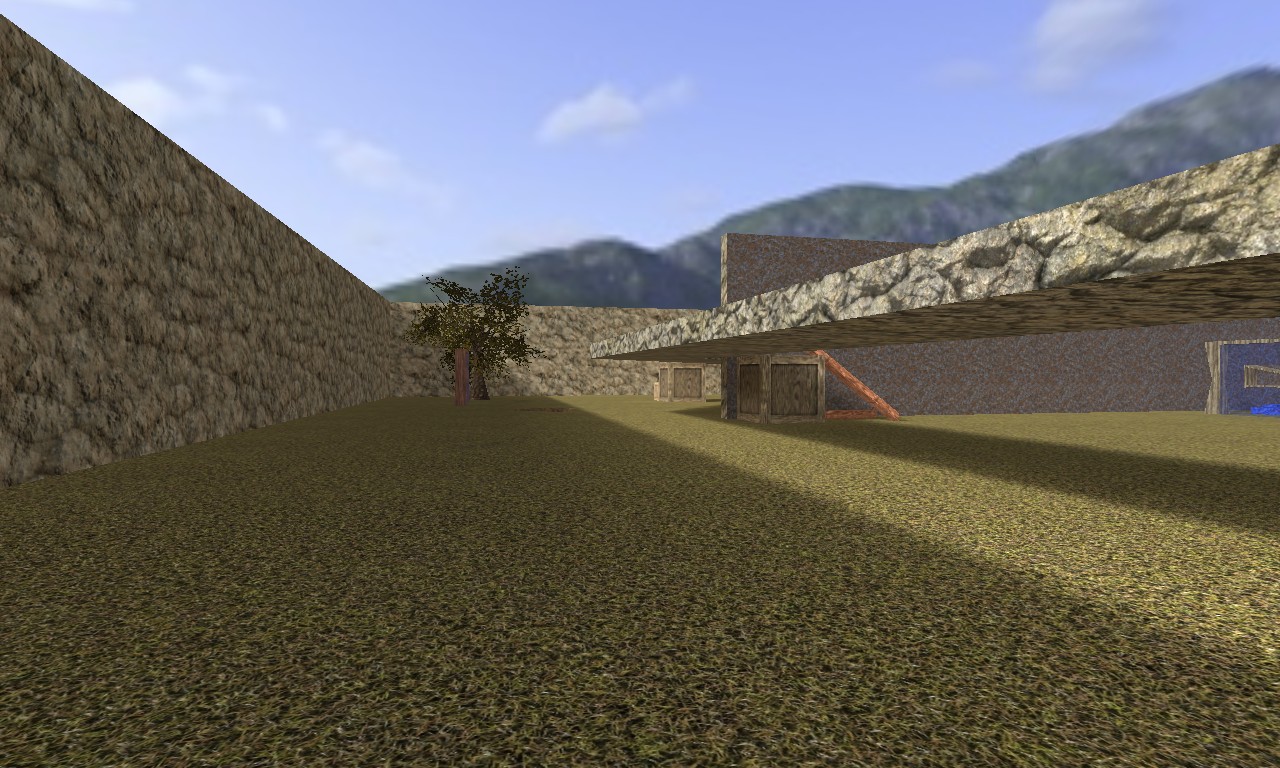
On here I dont like the bridge because it isn't supported by anything and it therefore does not seem realistic, I think it would be better if there was a support or two here it may also slow down play and add cover for the basses which are very open.
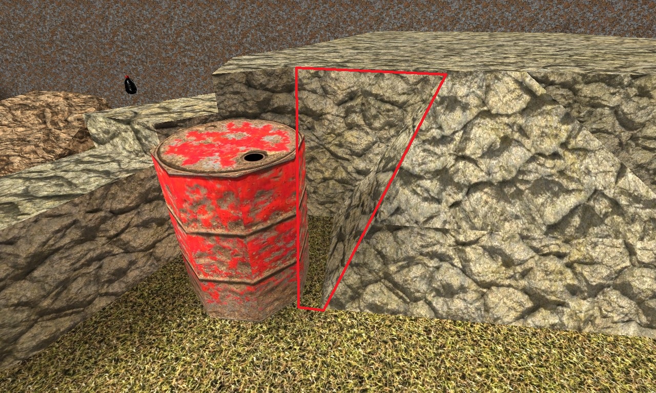
You can get stuck here very easily, just thought I would bring it to you're attention you may want to change it.
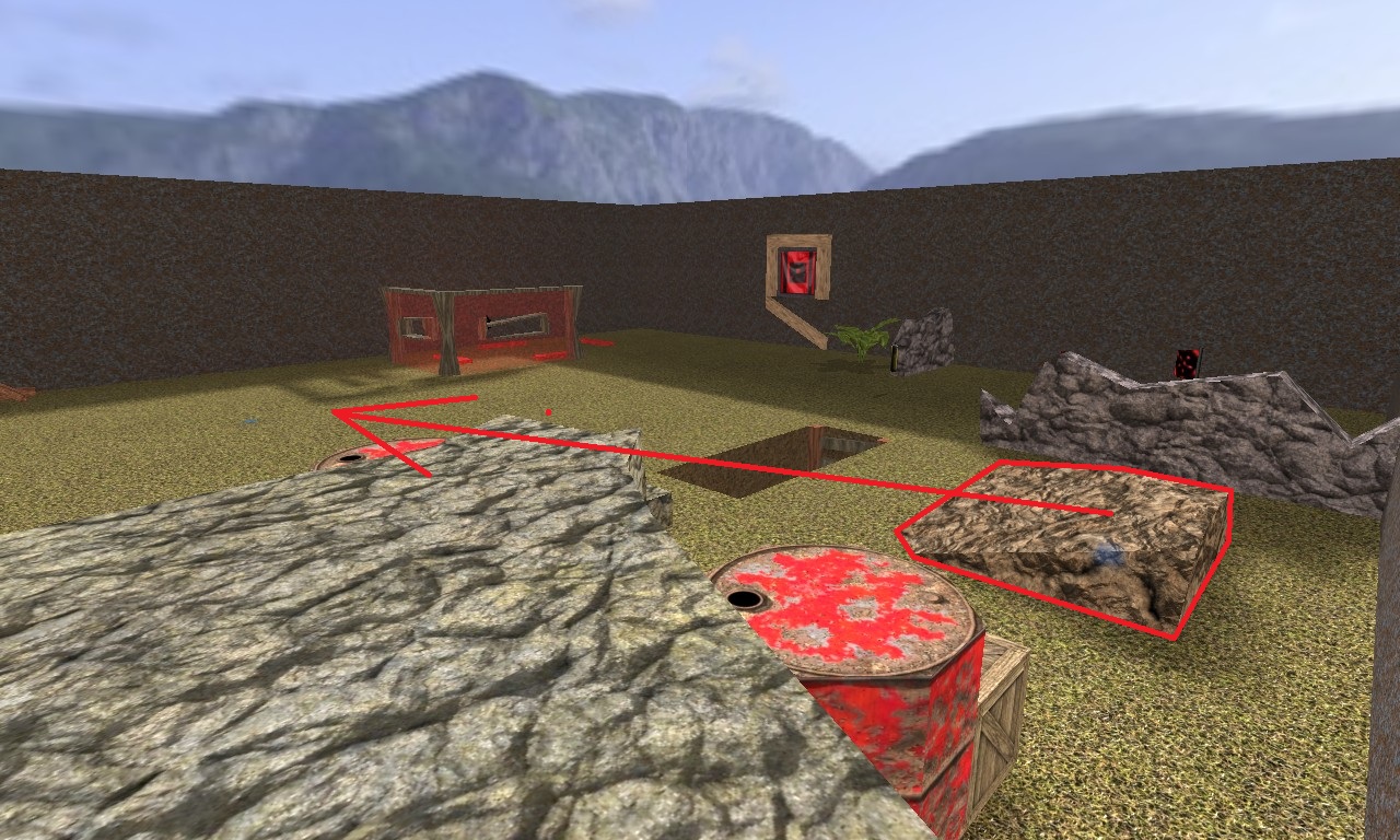
The base in the centre is very open; the area where the rock is is very compact it might be beneficial to move the rock into the centre of the base although I dont think a rock would suit that space well either.
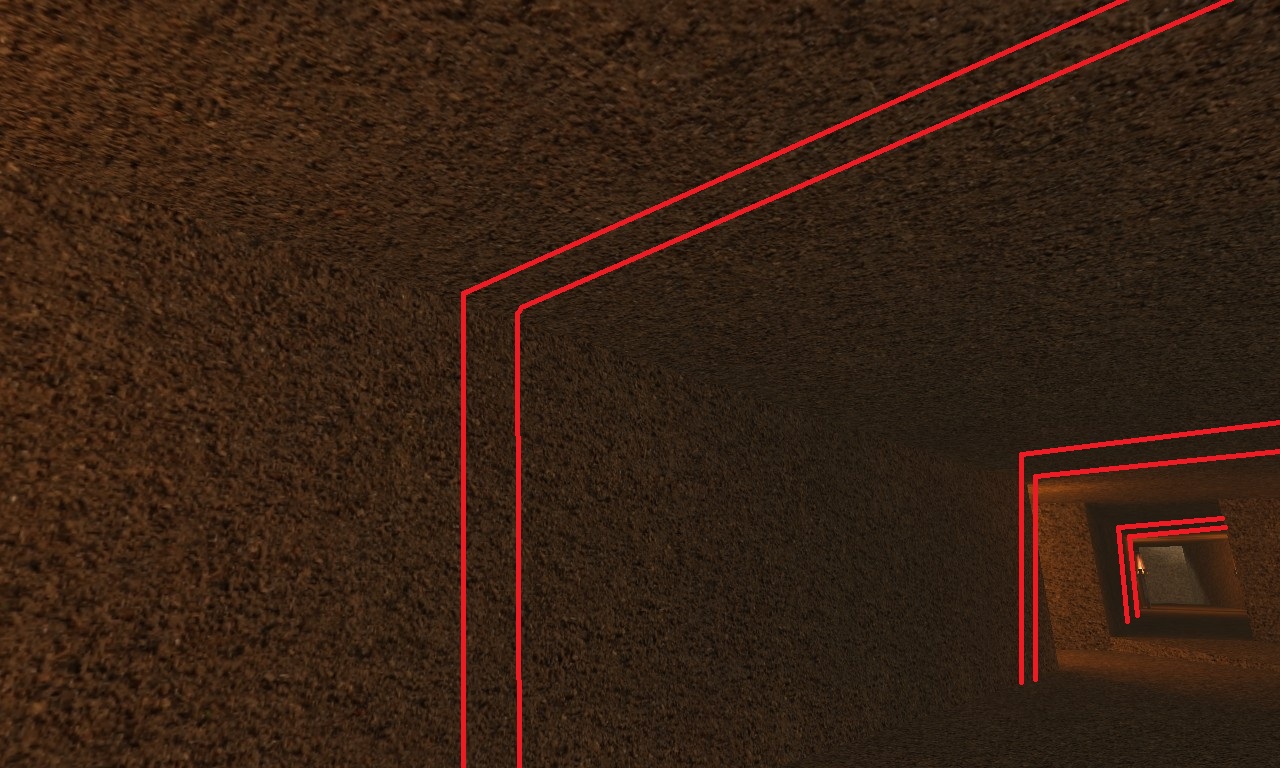
I think you should add some supports here as if would then make it look more realistic, also maybe texture the walls differently because for me personally there is too much mud about.
Again these are just my opinions, I did not comment on game-play because:
A: Its such a small map it is really hard to change it without changing the dynamic of it
B: I dont know that much about it.
By the way love the torches

Edit: I had to change one of the screenshots one did had the wrong link up.