Here is some analysis on the map of yours, hope it helps.
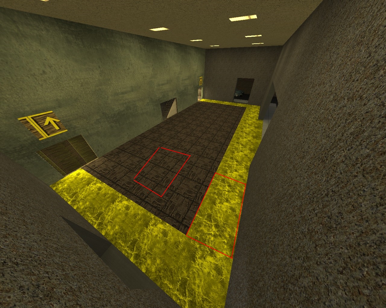
In my opinion these two textures don't go well together at all, Just my opinion other people may/ may not have it.
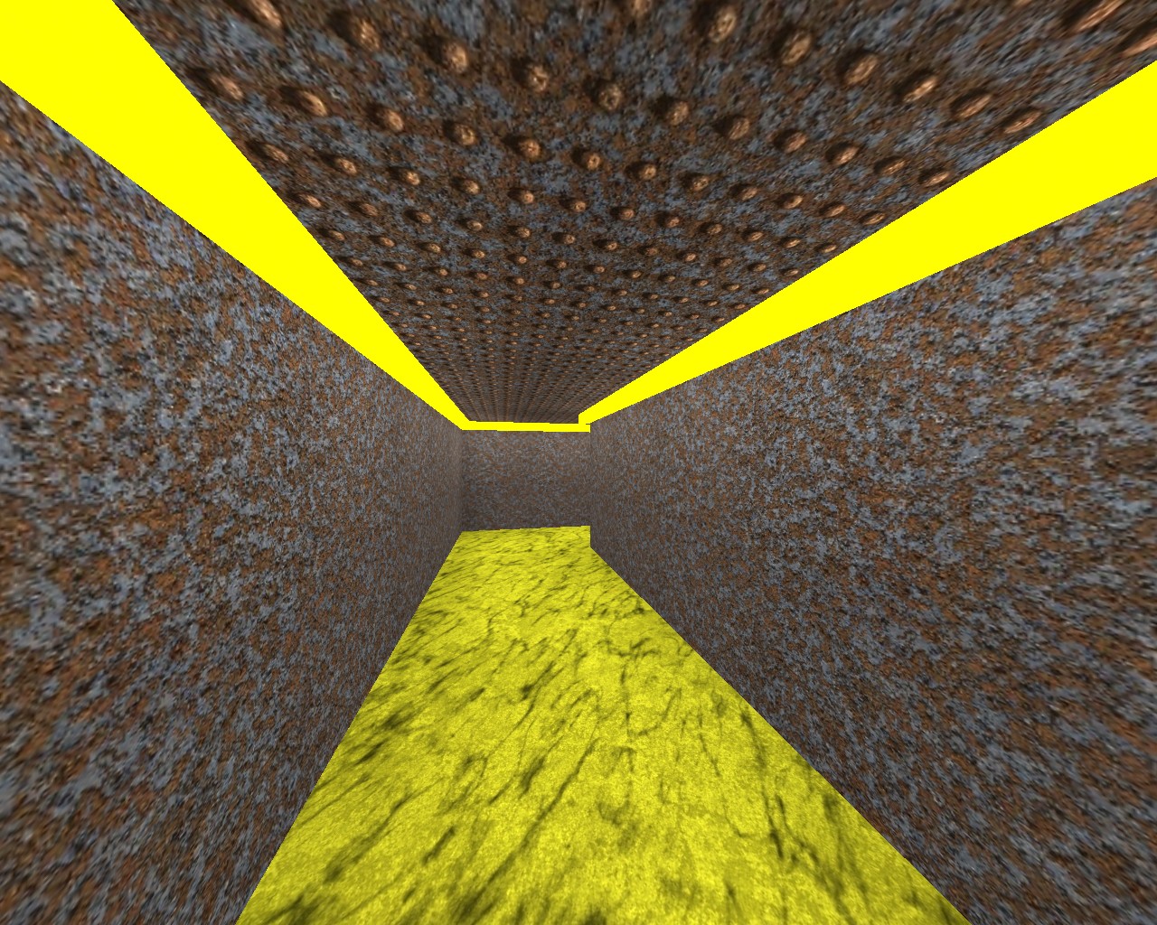
I do however like this bit, you sure do love those luminous colours don't you
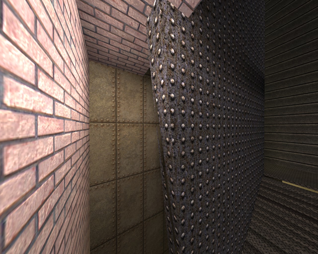
One of my major complaints is that there are so many different textures used and there seems to be no coherence. Even in the same building. Not only do some textures look out of place but they look random combinations mish mashed. The image above being a prime example the two walls on either side of the same building are different and the one straight ahead. That to me makes it feel unnatural and ugly.
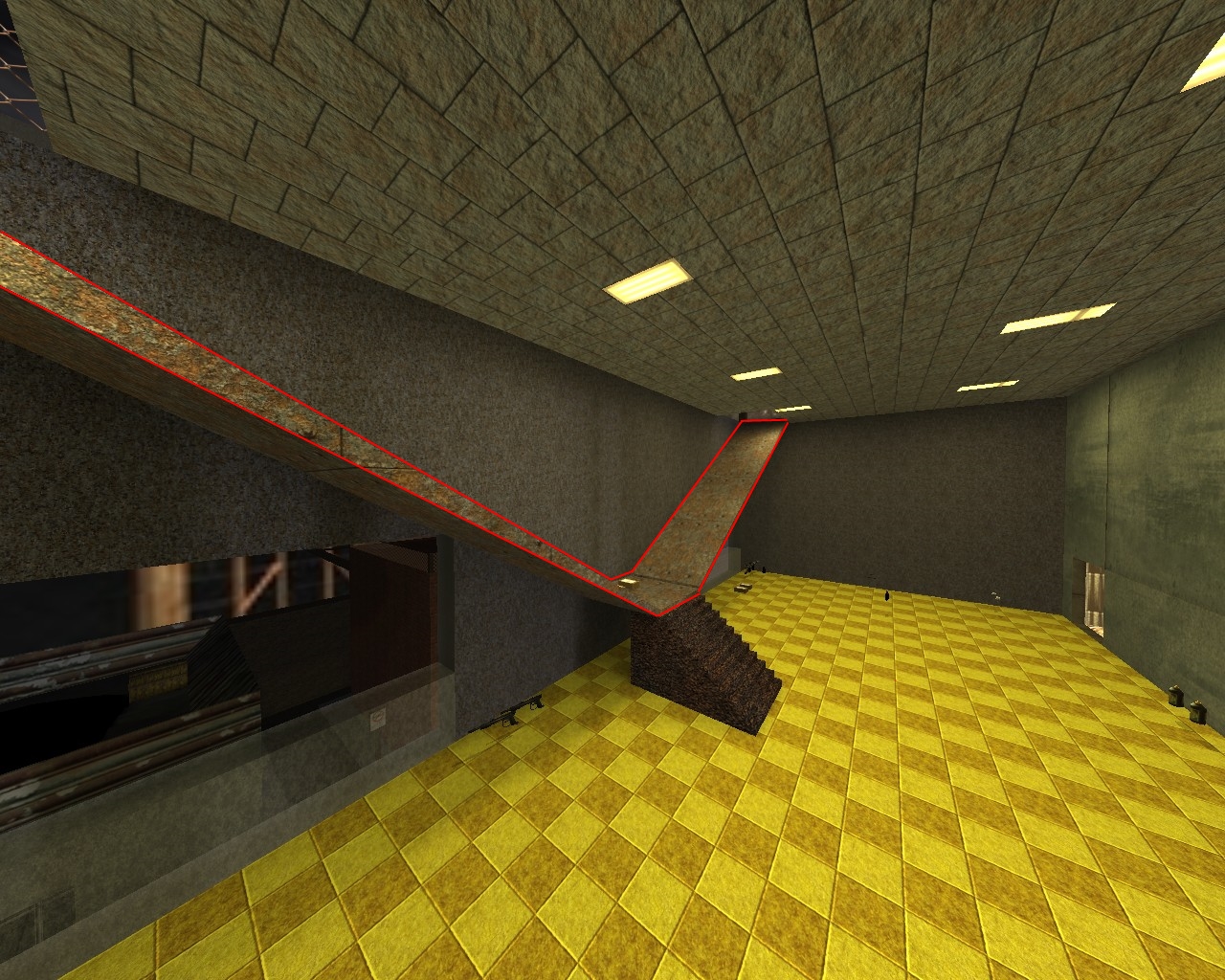
This in Red above seems very unnatural and out of place, I can see what you are trying to do but i think that a lack of detail and an (imo) innapropriate texture choice make this look a bit wierd. There is also a lack of detail in the room but im sure you will add that in due course
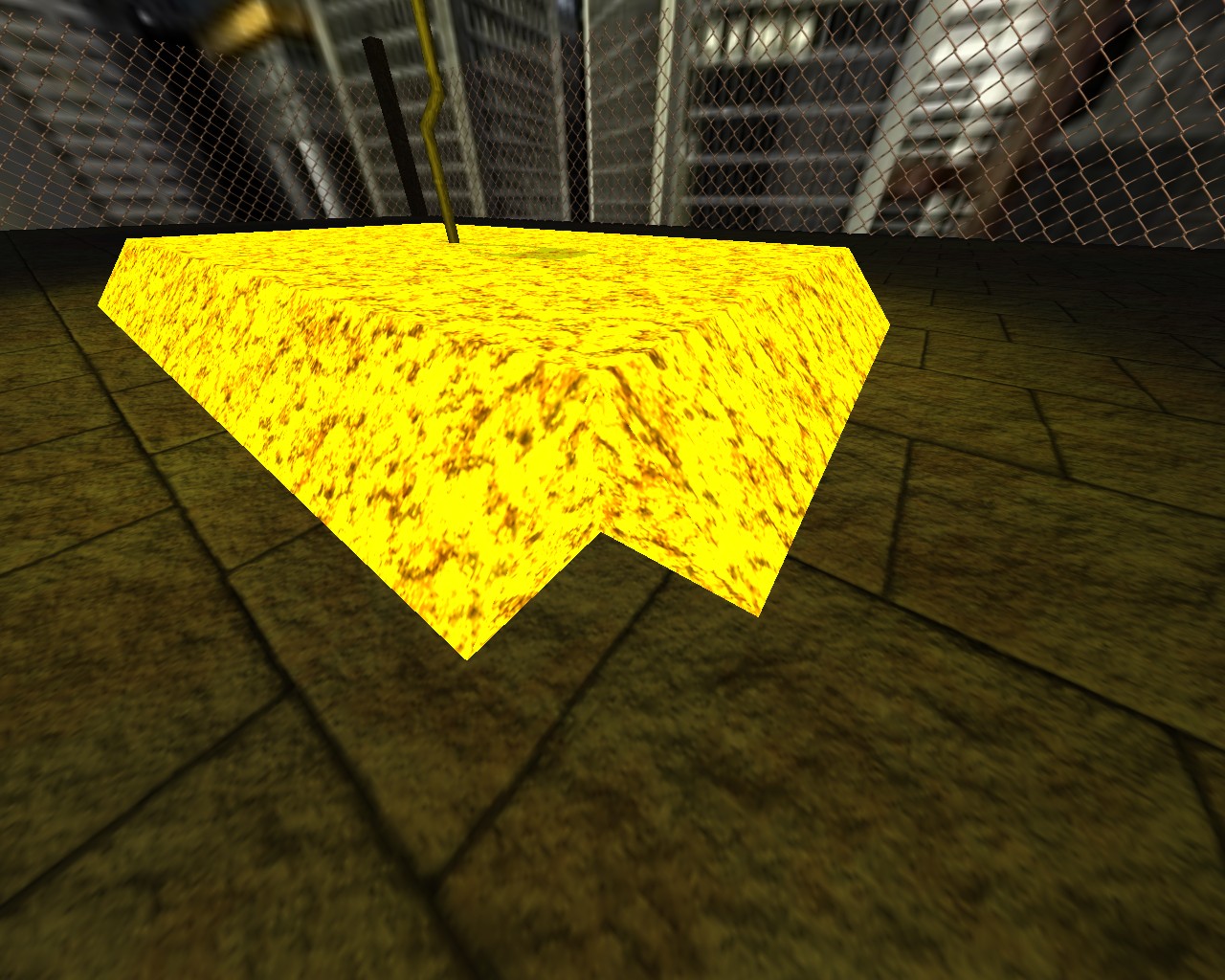
Shouldnt these corners meet? idk just looks wierd like that to me.
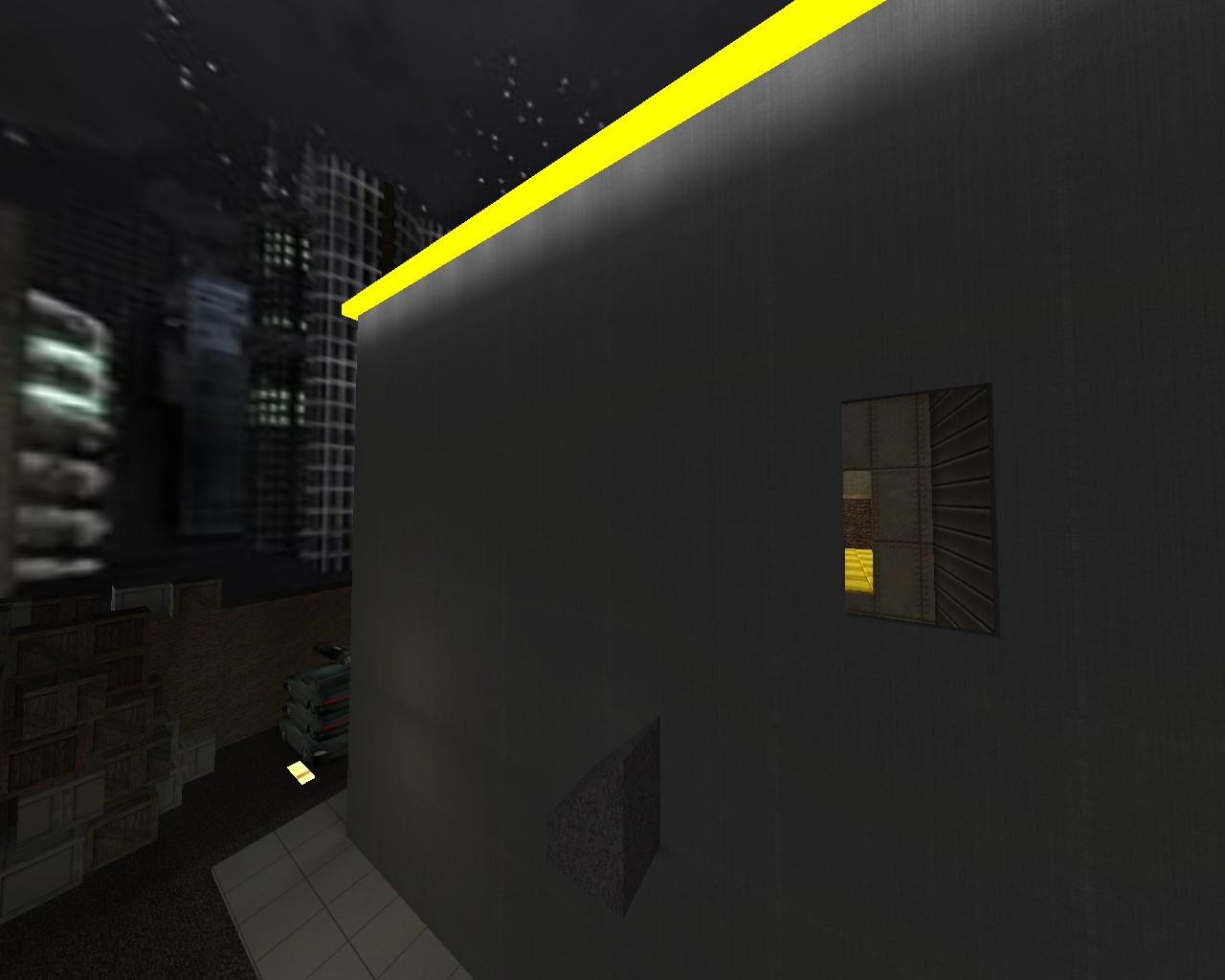
The wall to me just seems blank. That metal is a plain texture and has no detail. (thats not nessesarilly a bad thing) - It doesn't look realistic (again not a bad thing unless realism is what you are going for) - The lack of detail makes me wonder whether this is a building or a metal container.
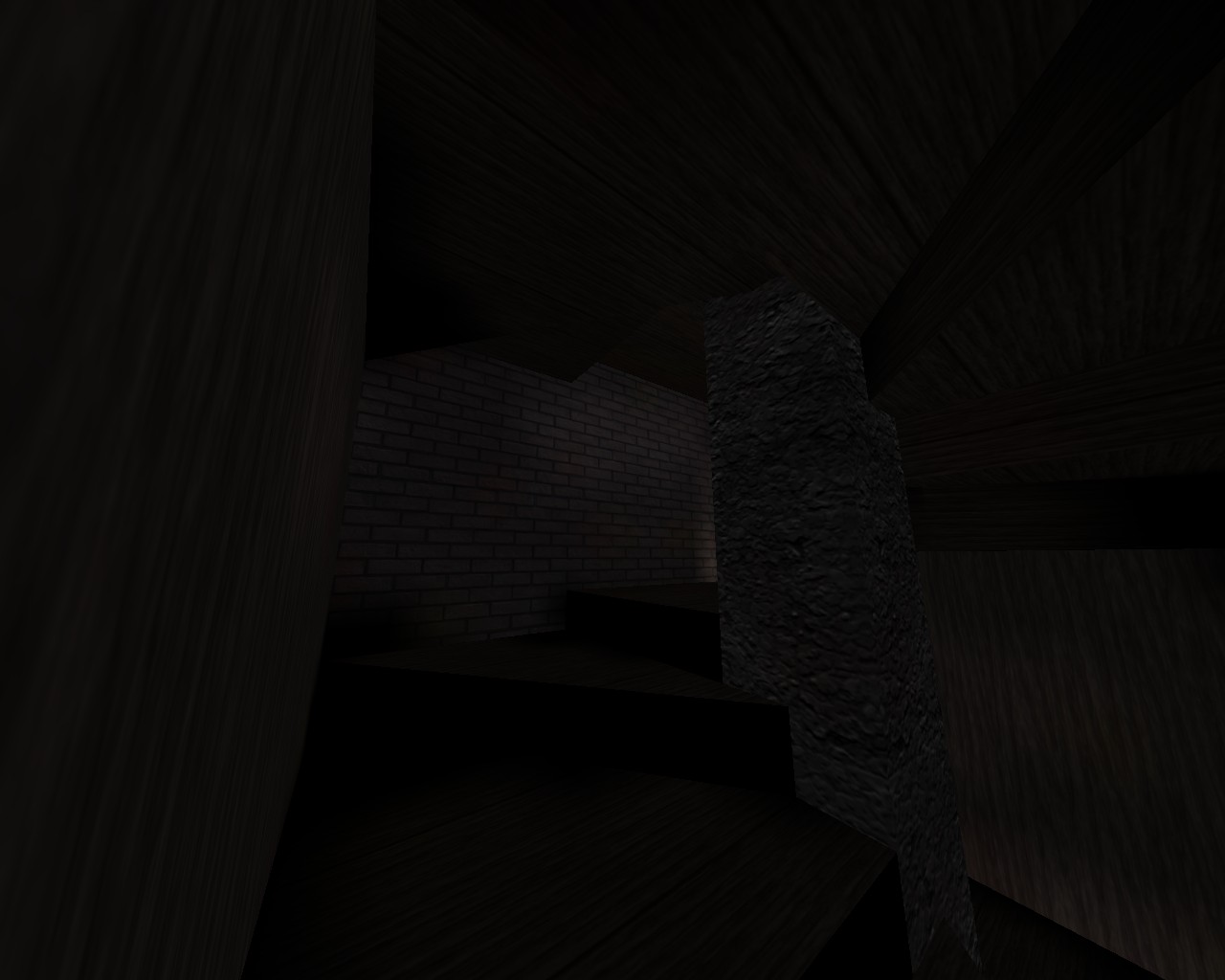
Very Dark maybe a little bit hard to see
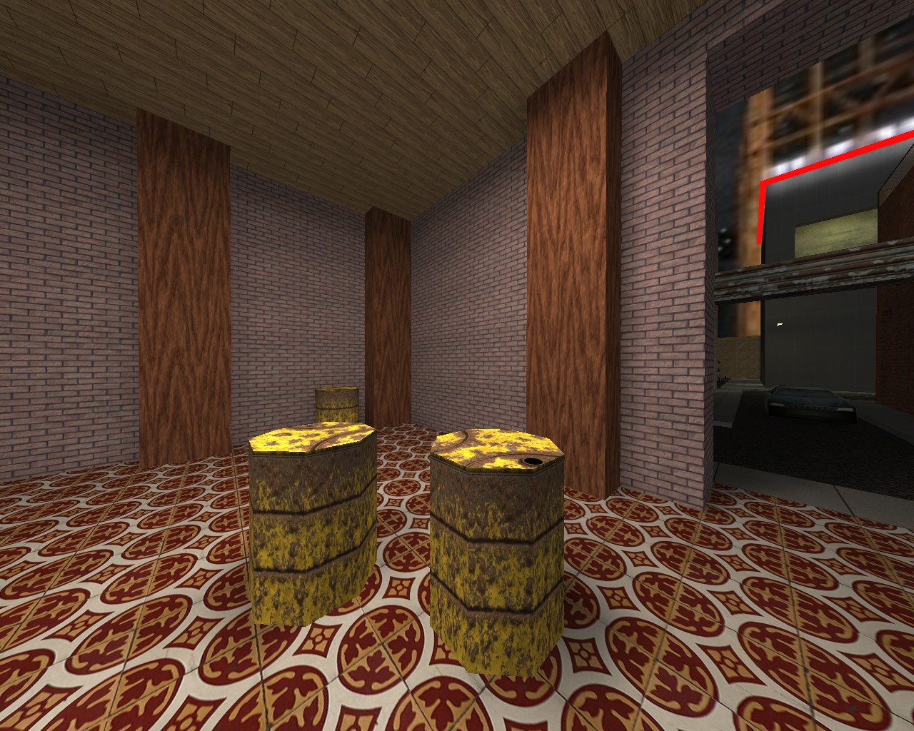
I really like your barrels what settings do you use?
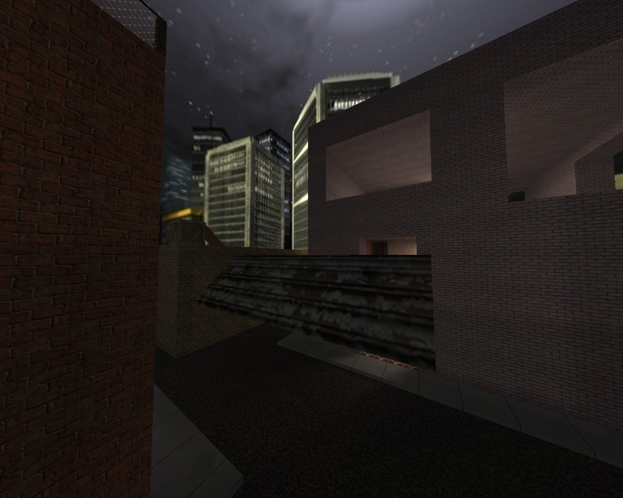
I think this is another example of what confuses me. i Cant tell whether this map is trying to be realistic or not. There is no consistent style, and i think a map definitely needs one to look good.
I had a few more but they should do for now.
I hoped this helped please don't take anything i say personally I just type what I think.

As far as game-play goes that's for a different time right now I think there are a few things that need to be changed. Good Luck.
Almost Forgot thanks for putting it in a zip really helps me out.