Author Topic: Tml2 Labyrinth, in the works.  (Read 3091 times)

EllsinoreOutlaw

  • PGP
  • Posts: 24
Tml2 Labyrinth, in the works.
« on: April 18, 2007, 11:29:54 PM »
Well I got another map in the works. This has mazes and other cool things. I must say this my best work yet.

Well I finally took some screen shots tonight. The map not done yet, i must say its really fun to play.  :D


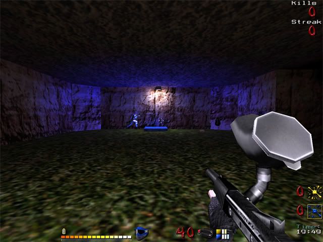
Here is blue and yellow base with touch of color lights i made.


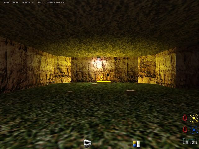
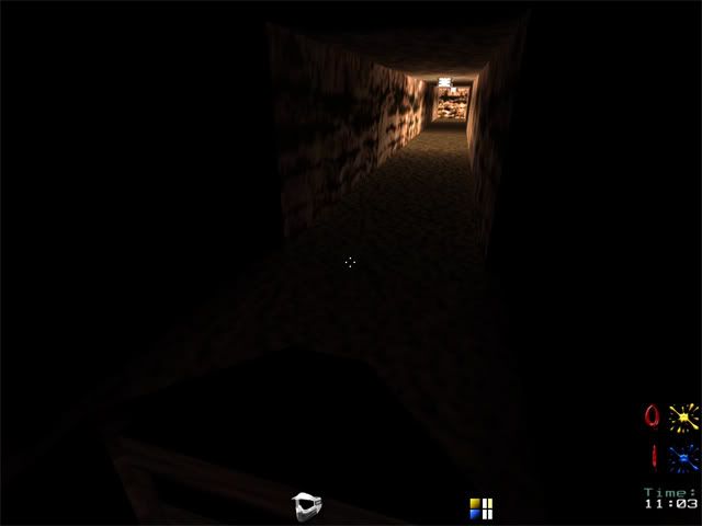
This is path from the base that leads to ladders.


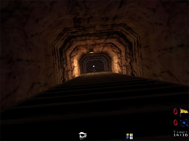
Going up! lol 64 steps on this ladder leading to next room up.


Well in this room from the ladder below leads to the Maze with Red lights.


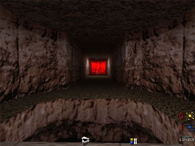
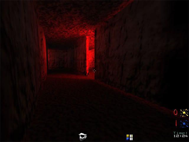
Now for the maze that i really love, yes you can get lost in there. If you don't know where to go! hehe


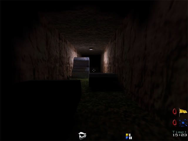
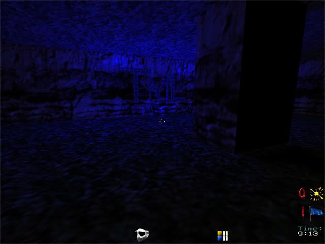
This is a secret place small hallway that leads to a room which I'm not done yet. This is just a bonus place! lol :lol:


Here is the secret room with TML on the wall. Plus with cool blues lights! Which I will add less blue in it I think.


Well thats it so far guys. Let me know what you guys think?

Eiii

  • Autococker
  • Posts: 4595
Re: Tml2 Labyrinth, in the works.
« Reply #1 on: April 18, 2007, 11:52:42 PM »
Too dark, and what little lighting there is is far too saturated. Also, the lights have no source- add one, otherwise it looks pretty bad. I can't really tell anything about the map, can't see it. :D

lekky

  • Autococker
  • Posts: 2449
Re: Tml2 Labyrinth, in the works.
« Reply #2 on: April 19, 2007, 06:34:50 AM »
i can't see anything but black so i cant really comment on the map :/

EllsinoreOutlaw

  • PGP
  • Posts: 24
Re: Tml2 Labyrinth, in the works.
« Reply #3 on: April 19, 2007, 10:51:22 AM »
I wanted it to be a dark place to play. Kinda like old underground mine. It fun playing with little light. Its makes it alittle spooky. hehe


Does anyone know how to make the lights flash, like its shorting out?

Zorchenhimer

  • Autococker
  • Posts: 2614
Re: Tml2 Labyrinth, in the works.
« Reply #4 on: April 19, 2007, 12:32:02 PM »
With the "style" key. Values from 1 to 6ish work. This one you have to mess around with first. Make a small box map for the sole purpose of testing out the light so you don't have to wait so long for a final compile.

jitspoe

  • Administrator
  • Autococker
  • Posts: 18802
Re: Tml2 Labyrinth, in the works.
« Reply #5 on: April 19, 2007, 12:49:59 PM »
You need more light, and a lot of the light you have needs sources.  Where is that mysterious blue glow coming from?  I'd suggest using some of the colored light textures as sources to get more natural colored lighting.  Some of tho colors you have are just too saturated.  Not only does it make it look unrealistic, but it makes it impossible to tell what team people are on in some areas.

Be careful with light styles if you use them.   They can cause severe framerate drops on some video cards and can also be really annoying.

The problem with dark maps is that some people have really bright monitors and will be able to see easily while others won't be able to see at all.   Then there are the people who will just crank all the brightness settings as high as they can and make the whole game look like crap just so they can see well in your dark map.

blaa

  • Autococker
  • Posts: 1218
Re: Tml2 Labyrinth, in the works.
« Reply #6 on: April 20, 2007, 05:35:33 AM »
I
Then there are the people who will just crank all the brightness settings as high as they can and make the whole game look like crap just so they can see well in your dark map.
I guess if a player is smart enough to edit the brightness settings then he is smart enough to turn it back.
plus, maybe the sshots are just too dark, the overall map may be a lot better, but but, I would choose blue side 100%, with the sshots you gave (1 and 2) I can tell that  blue player is alot less visible in his base than yellow player in his base..

jitspoe

  • Administrator
  • Autococker
  • Posts: 18802
Re: Tml2 Labyrinth, in the works.
« Reply #7 on: April 20, 2007, 12:06:42 PM »
My point is, people will sacrifice visibility over visual quality.  I know this isn't the best looking game, but there's no sense making it look worse.